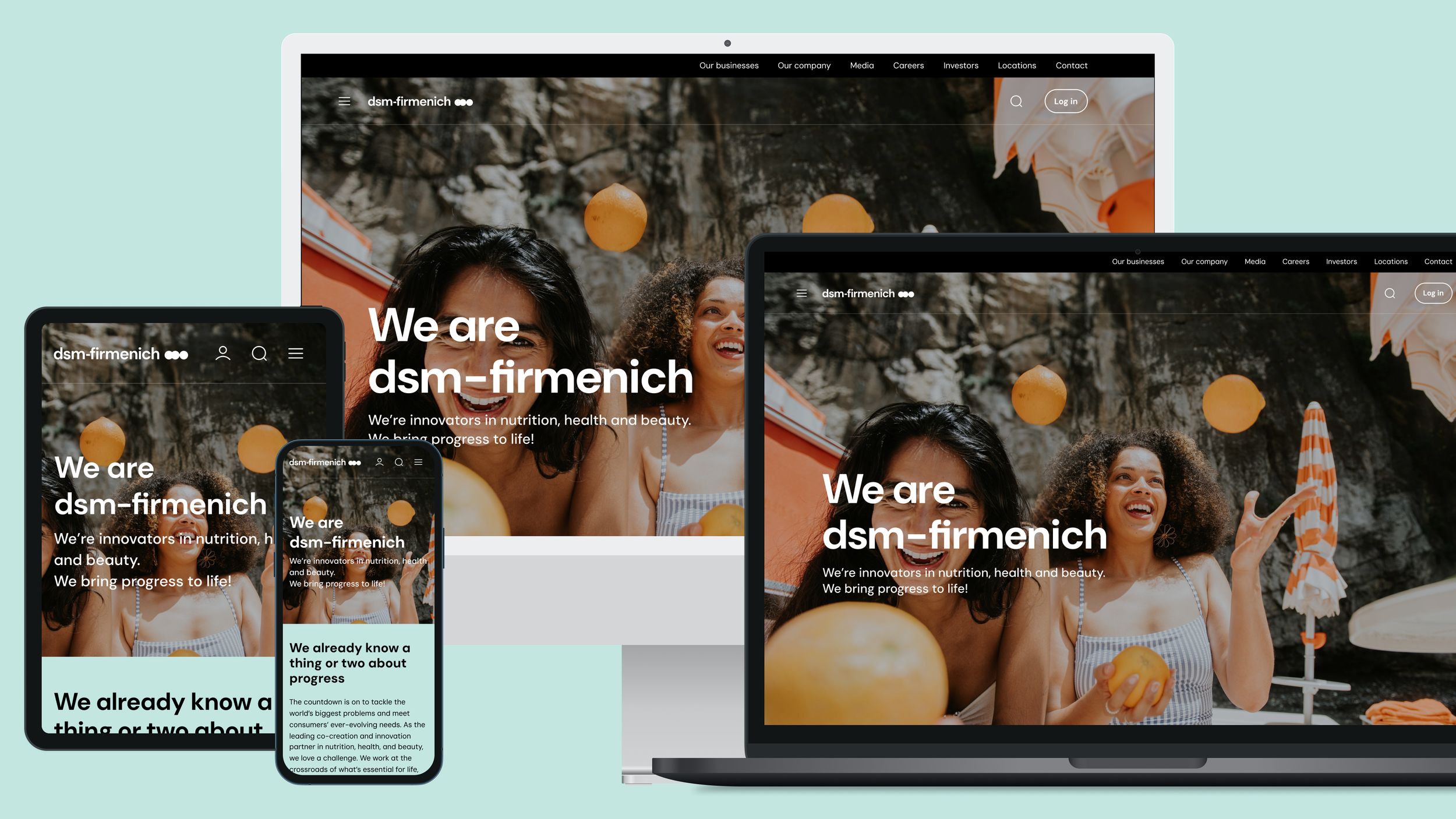
Creating a unified digital experience for a global brand
The project won iF DESIGN AWARD in the category of User Interface Design

Context
dsm-firmenich is a company with four businesses that dominate the world of Beauty & Perfumery, Taste & Texture, Healthcare and Animal Nutrition.
Dsm and Firmenich, two companies merged into one dsm-firmenich
The merger brought with itself a dozen of challenges. After the merger the company was rebranded, with no guidance on digital. Dsm-firmenich reached out to Accenture Song to help out with the Digital Strategy and User Experience design for their website.
Project duration
June 2023 - June 2024
Note*
For the purpose of confidentiality, not every detail is shared, and the materials are not disclosing any data.
My Role & Responsibilities
Lead the complex information architecture & web navigation system stream
Lead the team of designers on the project
Design System creation
Stakeholder management
UI/UX Design & Prototyping
Research & Usability validation
The success of such a massive project was due to having a clear, well-defined process in place and communicating Design trade-offs with data for efficient decision-making.
Discovery findings
As a result of Interviews with designers, marketeers, content creators, Business Unit leads we uncovered the direction for our focus.
The merger resulted in 68 legacy websites, creating inconsistencies in branding and user experience.
Design and development workflows were slow, leading to delays in launching new pages and websites to market.
Heavy reliance on external agencies to design and development of pages and websites.
Users encountered inconsistent designs and information architecture, leading to a disjointed experience across platforms navigation issues and broken workflows.
No central documentation or guidlines what to create and what not, resulted in all the agencies and individual teams doing whatever they wanted.


Defining the Vision & MVP
From the findings we understood that the core purpose was to have a unified Design System in place so that marketers, designers, external agencies would have a central place to visit to create experiences fast and efficiently. And that would decrease the time to market of the new products.
Information Architecture Strategy
& Validation
We understood that instead of creating the actual information architecture. we need to provide a framework to all the business units and departments, for them to create the actual information content themselves.
So we had to come up with category and subcategory structures that worked for all the businesses and units.


Qualitative & quantitative usability testing of the new IA
After the qualitative research with 8 participants we understood that it was not enough to communicate the validity of the direction. So we launched a quantitative test on Maze (fantastic platform for user testing btw).
This gave the confidence both to the design team and stakeholders to move forward with the purposed navigation ui and information structure.
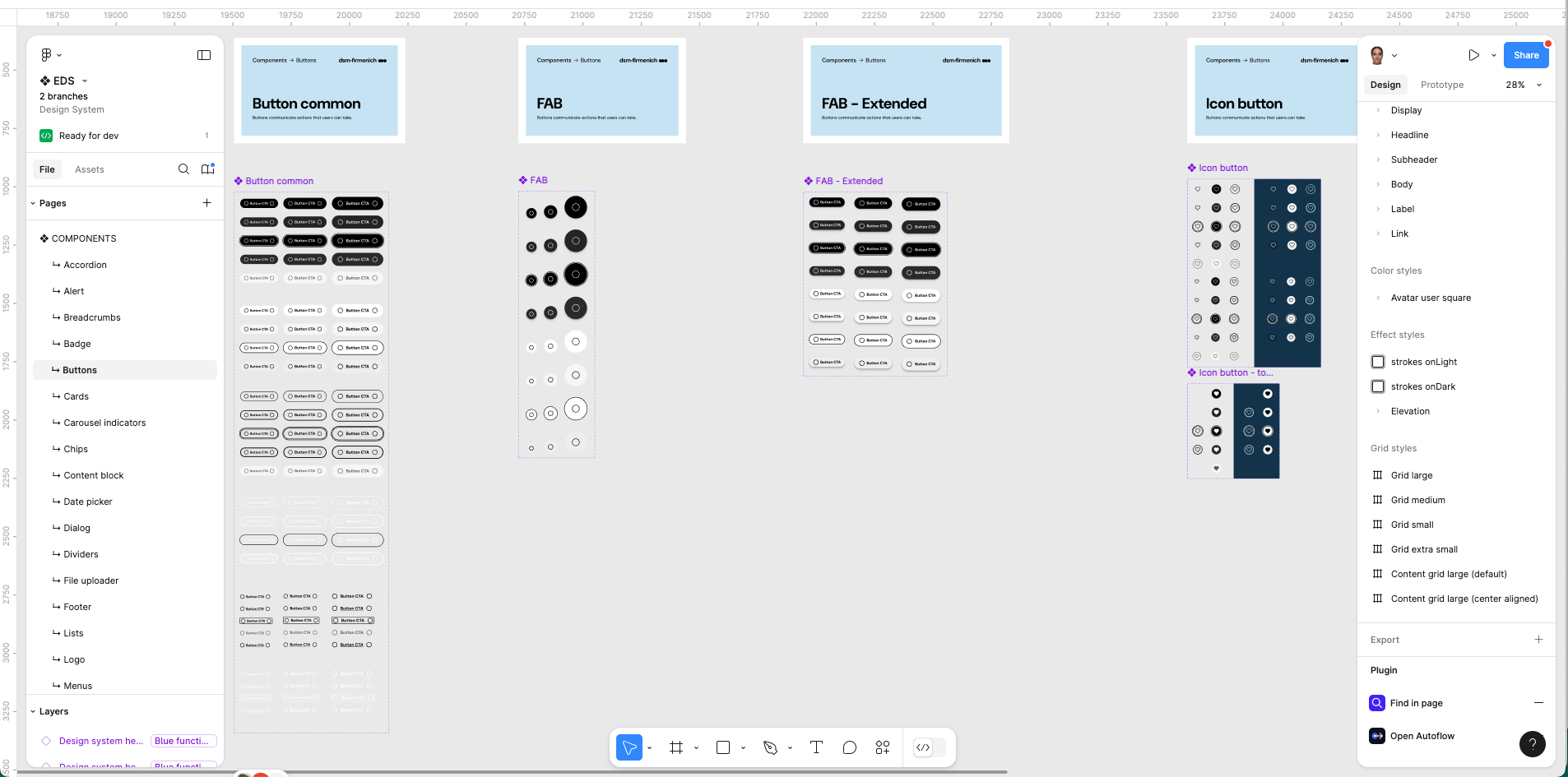
Complex Design System Creation & Development
This was the most complex Design System I have ever created. And the complexity was in the translation of its brand to Figma tokens, to make sure they work perfectly when you change the appearance from one theme to another.
Components
Page sections
Page templates
Design System documentation


Outcomes & Impact
01.
Improved UI consistency across websites and platforms.
02.
Redused design debt by minimizing ad-hoc and inconsistent UI creation over time.
03.
Reduction in time taken to launch new features or pages due to reusable components.
04.
Time saved in both design and development by using predefined elements from the design system.
05.
Degree of adherence to accessibility standards, such as WCAG, achieved through the design system.
06.
Decrease in external agency or freelance design work as more elements are created in-house using the design system.
3 Big Takeaways 🤩
This project wasn’t just about creating a beautiful and functional website, it was about building an information architecture that combines around 60 websites into one scalable information structure and navigation system that serves both users and business goals.
01.
User testing results helped us to communicate the tradeoffs to a large group of stakeholders
Imagine convincing around 30 stakeholders, owners of 60 different businesses and websites who never worked with each other before, to agree on a ONE singe information architecture and website navigation system in a few group workshops. Just imagine! :)
02.
Agreeing on the MVP product vision helped us to stay focused on what are we trying to achieve, to avoid change of direction in the middle of the project
All of the stakeholders had different wishes, different ways of working and were used to different information setup of their websites…it’s usually hard to let go off if you are used to certain things.
03.
Spending extra time on the scoping and agreement of deliverables at the beginning of each phase, saved us a lot of re-work
When you work on a design project with such a large group, usually stakeholders try to bring the wishes during the process of the project, and having a clear shared understanding towards what are we working helped us a lot of scope creep.
The team
There is no success in work if there is no great team behind.
Internal Team
Business analyst
5x Designers
Developers
Design Lead 🙋🏻♀️
Delivery lead
Design strategists