
Company - HEMA
Optimizing the Information Architecture & Web Navigation
My role & responsibilities
Lead the UX Strategy and design execution
Balancing business needs, user behaviors and SEO considerations.
Guide the UX Researcher and Design analyst
Oversee the delivery and quality of the Design
The internal team
Product Owner
UX researcher
UX analist
Product Design Lead 🙋🏻♀️
Delivery lead
PROJECT GOAL:
Help Hema to explore alternative navigation based on modern shopper’s mindsets and way of buying
Context
Google reached out to Accenture Song to help Hema with Website navigation optimisation.
As a UX lead, my focus was on elevating Hema’s navigation experience, aligning it with modern shopper behaviors and optimizing the balance between SEO and UX. The challenge was to analyze, test, and refine the recently released navigation while exploring innovative alternatives to enhance usability and business impact.
Note! All the rights are reserved to Accenture Song, Google and Hema. The work was done my be as I worked at Accenture Song.
Project duration
1 month
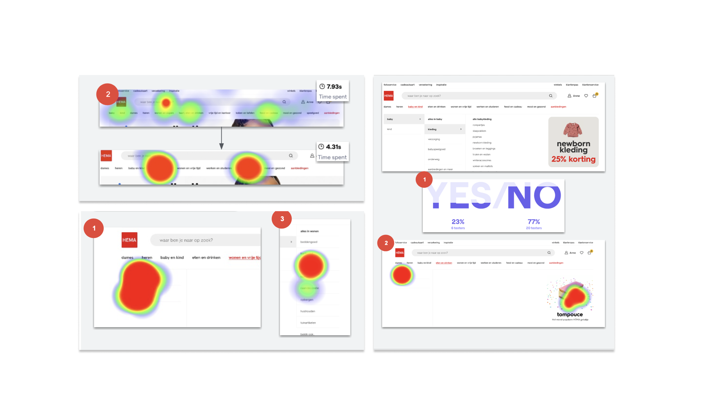
Research Insights & Data-Driven UX Decisions
Visits With and Without use of navigation
Conversion rate and avg. odervalue are significantly higher for visits with the usage of navigation in comparison to visits without the use of navigation.
The revenue also shows a higher performance with the number of sessions for visits with the use of navigation compared to searching the item.
Average amount of pages per sessions and the average sessions duration are significantly higher for visits with the usage of navigation in comparison to visits without the use of navigation. (coming from the ads, or using the search bar
Significantly lower bounce rate and Exit-rate are found for visits with the use of navigation in comparison to visits without navigation.
Usage of different navigations
Desktop
Users within desktop use the submenu displayed directly on the page. However, underlying pages do not show all subcategories under this category as shown in the hamburger menu.
Mobile
Users on mobile show a relatively equal use of Hema navigation. Though the hamburger menu is used more frequently.
Overlap of categories
Several categories overlap (e.g. users who see "kind" often also see "baby"). This shows that combining these categories would not impact findability of products. It could even increase average item quantity as users will be shown products they want/need without needing to navigate to another section.
Usage mobile levels (only browser, NOT APP)
Within the mobile menu a big drop-off can be seen after level 1. This means that people click on a category however they do not continue to the next click in the subcategory.


Learnings & insights
Merge related categories
Decrease the UI size of categories to display more and remove friction of scrolling
Group related items into clear sub-categories, to remove the choice paralysis
Add icons to the list of sub-subcategories to assist faster item scanning
Run ongoing small tests, rather than focus on one time ad-hoc research
The real challenges and learnings
Hema is a large-scale organization and a lot of decisions need to go through a lot of sign-offs
It's possible to test, validate and learn things by testing, however to get real results a real A/B was required
A lot of different factors influence how buyers search for things
We understood that no matter how you categorize the information architecture, in commerce website, 7 out of 10 people will use the search rather than the menu
To reinforce insights, we leveraged findings from Nielsen Norman Group (NN/g) research on navigation vs. search behaviors in e-commerce.
Contextual triggers such as promotions, personalization, and behavioral nudges can shift search patterns.